- Basis Points
- Posts
- 7 Charts That Explain the Iran Conflict (and What Markets Might Do Next)
7 Charts That Explain the Iran Conflict (and What Markets Might Do Next)
Equity Mates
March 04, 2026


7 expert investors pitching their best ideas for 2026.
Next Friday, join us on The Island for the inaugural Basis Points Boat Party.
Tickets are complimentary to the Basis Points community – use code BPBP_TIX at checkout.
Spots are limited and exclusive to advisers. Please ensure you can commit to the afternoon before securing your spot.

Big Things Ahead: Ally Selby is taking over Basis PointsIt has been an amazing first year of Basis Points, but the second year is going to be even bigger with Ally Selby taking over! Think bigger guests, more episodes and finding more improvements that can compound into big outcomes. |  |

7 charts that help us understand this Middle East conflict
The Iranian conflict is dominating headlines and is front of mind for all investors. With plenty of explainers doing the rounds, we’ve collected 7 charts that have helped us understand the economic impact of the conflict so far and what may come next.
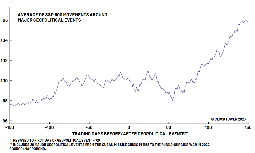
1. Don’t Panic
For us, this is the most important message and should lead any client communication. It is a scary moment and the natural impulse is to take risk off the table. However, history shows us that markets often rise after major geopolitical situations.
Why? Economies often heat up as governments increase spending, which can increase employment and output across an economy.
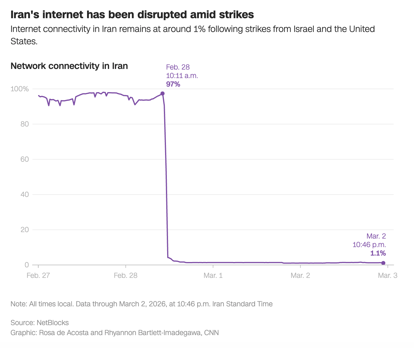
2. Iran’s been disconnected from the world
The US and Israel have effectively disconnected Iran from the outside world. With 97% of the country connected to the internet on Friday, now just 1% of the country remains online.
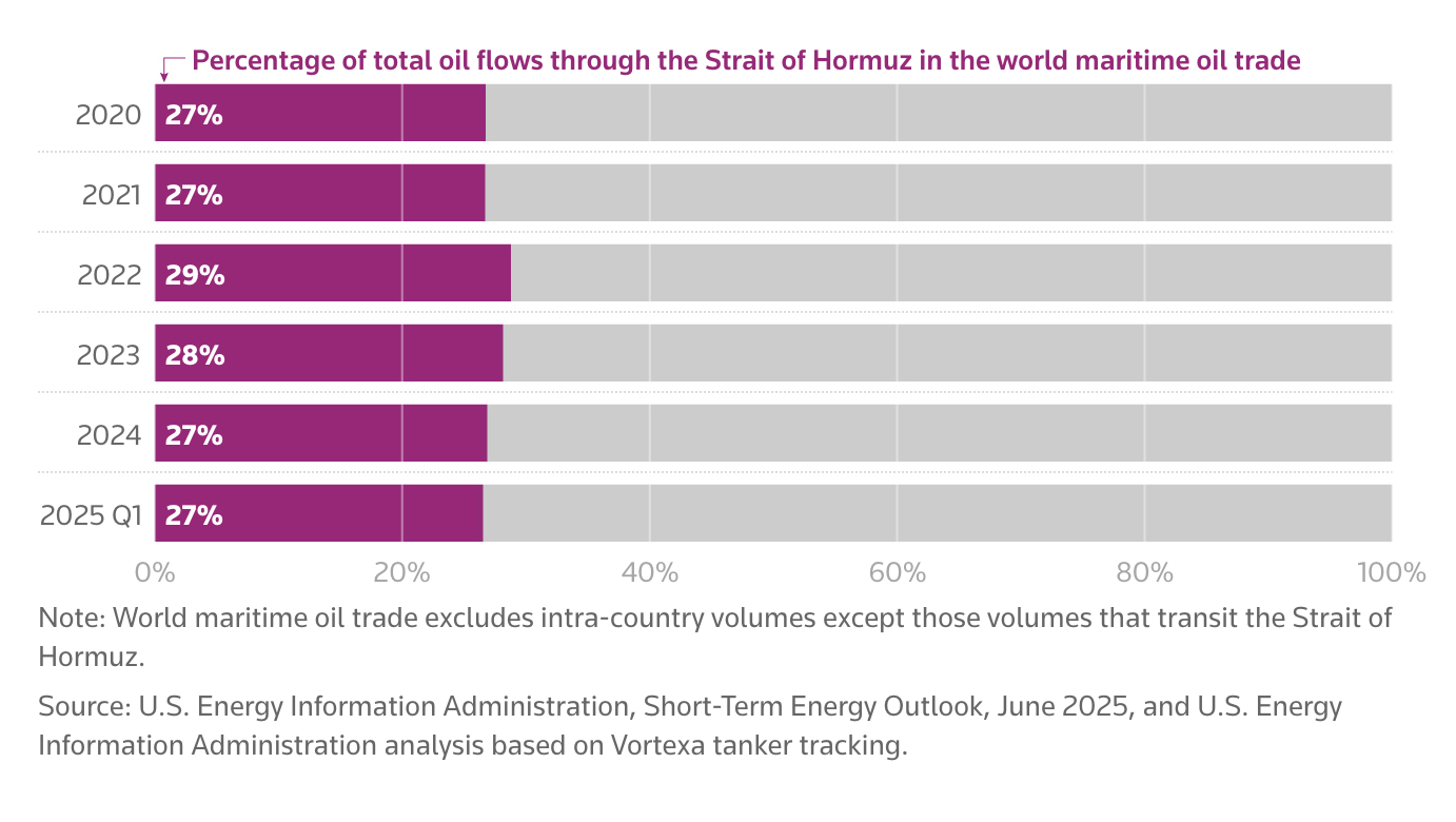
3. Oil prices are spiking
At the end of last week, the global benchmark Brent Crude sat around $71 a barrel. On Monday it hit $82 a barrel and it keeps ticking higher.
A major reason why is the Iranian navy has shut down the Strait of Hormuz, a key shipping lane just 39km wide at its narrowest point. As the chart below shows, more than one-quarter of the world’s oil passes through the Strait each year.
Basis Points is supported by Milford

Resources are back in the spotlight.
Geopolitics, decarbonisation and the AI energy boom are reshaping global commodity demand - and Australia sits at the centre of it. Gold, copper, lithium and even traditional players like gas and iron ore are gaining momentum as supply tightens and investment accelerates.
Milford Portfolio Manager Greg Cassidy, sits down with Bryce and Ren from Equity Mates’ Basis Points to explain why now is the time to rethink exposure to real assets. The next phase of the commodity cycle could be bigger and broader than many expect.
Milford is an active manager with views and portfolio positions subject to change. This content is intended to provide general information only. It does not take into account your investment needs or personal circumstances. It is not intended to be viewed as investment or financial advice. If you are in need of financial advice, you should speak to a Financial Adviser.
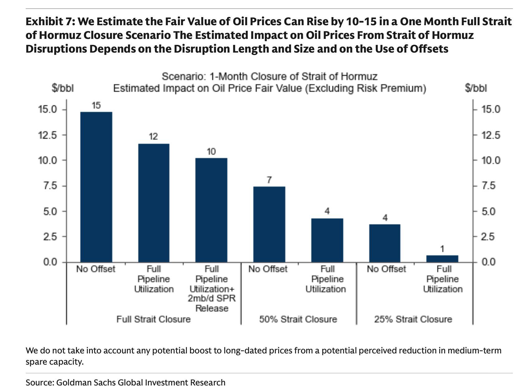
4. Oil could push $90/barrel
This chart from Goldman Sachs considers the impact of one month closure of the Strait of Hormuz. Their conclusion? A full closure of the Strait would add $15/barrel to the global oil price.
5. There’s more than oil at stake
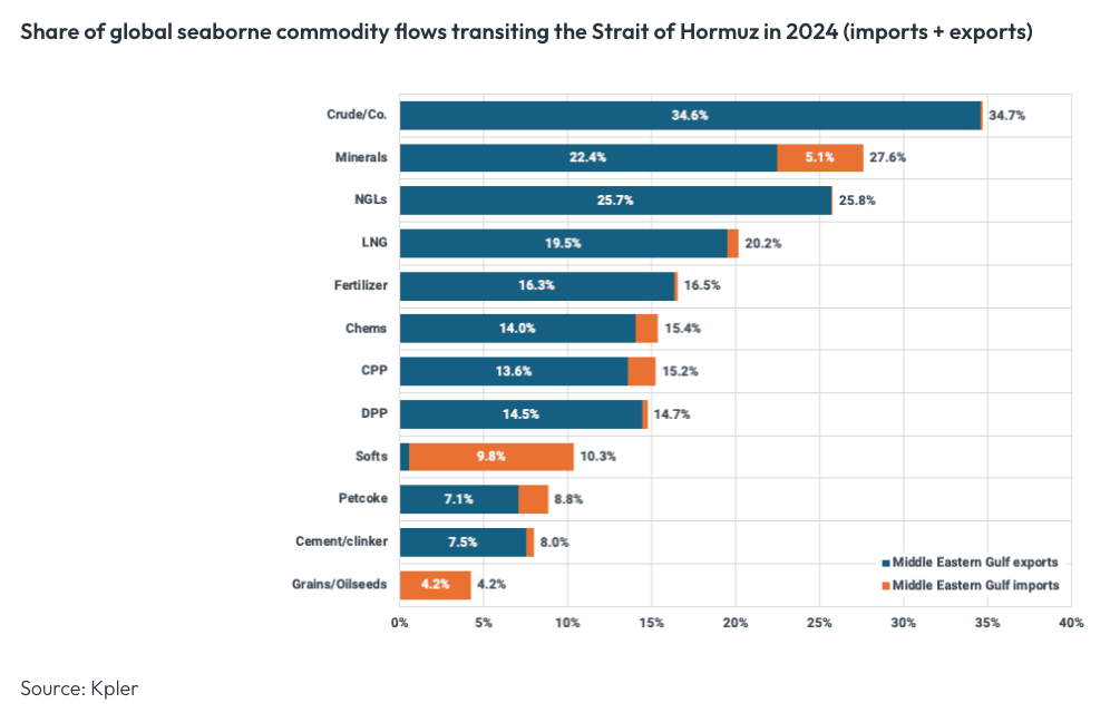
While the conversation has been focused on oil, the Middle East is a critical trading partner for many important commodities. Looking particularly at the Strait of Hormuz, it is a key shipping lane for oil by-products as well more than 15% of the world’s fertiliser.
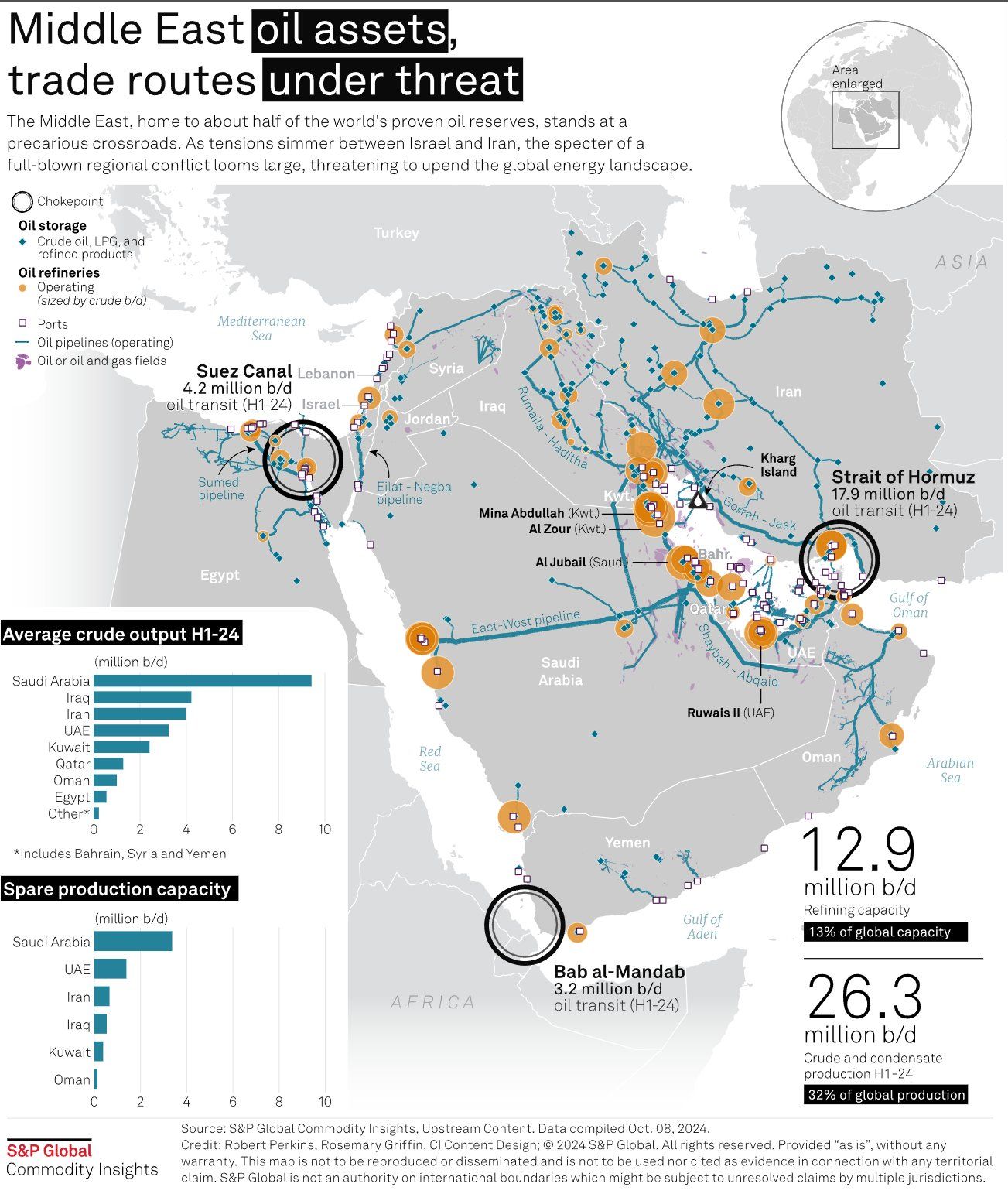
6. It’s about more than the Strait of Hormuz
You might need to zoom in to get the full details of this chart. However, it shows that a broader regional conflict may threaten other shipping choke-points, namely the Suez Canal and Bab al-Mandab.
Four days into the conflict and we’ve seen Iranian missiles reach as far as a British base in Cyprus, and Saudi Arabia shut down its largest oil refinery after intercepting Iranian drones nearby. The risk of regional escalation is real.
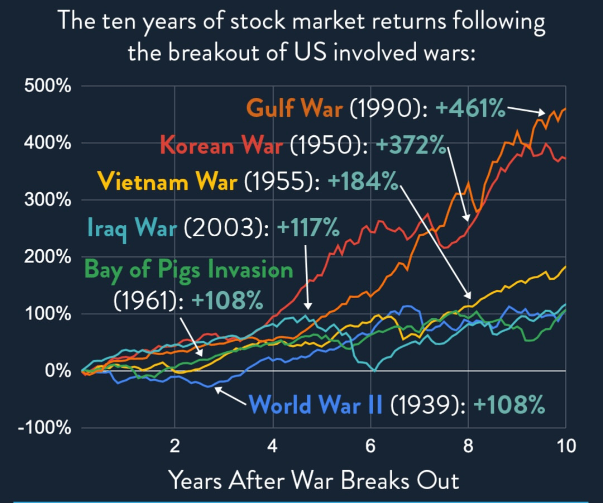
7. Remember: Don’t Panic
To finish where we started. Moments like this are scary. But the story of the stock market is a story of overcoming a wall of worry.
What’s more, history suggest that wars have generally pushed markets higher as government’s increase spending to support their war efforts. This final chart looks at the American S&P 500 ten years after some of the major wars of the past 75 years.